A Practical Guide to Quasi-Experimental Methods (PSM and DID)

A quasi-experiment is an empirical interventional study used to estimate the causal impact of an intervention on target population without random assignment. - Wikipedia
In this tutorial, we use simple datasets to illustrate two quasi-experimental methods: Propensity Score Matching (PSM) and Difference-in-differences (DID). We focus on the practical side of applying the methods and provide code in both Python and R via Kaggle (see links below).
This is joint work with my friend Dr. Gang Wang.
Propensity Score Matching
Propensity Score Matching (PSM) is a quasi-experimental method in which the researcher uses statistical techniques to construct an artificial control group by matching each treated unit with a non-treated unit of similar characteristics. Using these matches, the researcher can estimate the impact of an intervention. - World Bank
We use two datasets to show:
- why matching matters via a simple simulated example
- why propensity score matching is needed and how to do that in Python and R using a Groupon example
The Groupon dataset is from Gang’s paper.
We have shared the datasets and code (Python by me and R by Gang) on Kaggle:
- Simple Matching (Python)
- Simple Matching (R)
- Propensity Score Matching (Python)
- Propensity Score Matching (R)
We only focus on the key concepts and issues in this tutorial and advise the readers to go over the annotated code for details.
Simple Matching
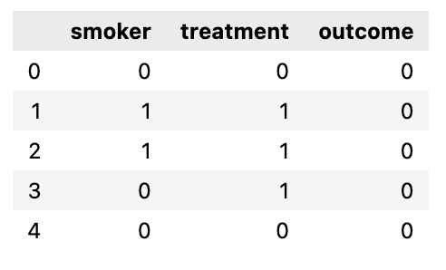
smoker.csv is a simple simulated dataset about patients with three columns:
- smoker: 1 yes, 0 no
- treatment: 1 treated (treatment group), 0 not treated (control group)
- outcome: 1 dead, 0 not dead
If we ignore the smoker status and compare the death rate in the control group (23.5%) and the treatment group (34%), we would have the following conclusion:
Given the ATE (average treatment effect) is 0.105 (0.34 - 0.235), the percentage of death will increase by 10.5% if the treatment is conducted.
So, the treatment should NOT be done.
Now let’s look at the smoker patient ratio in control and treatment groups:
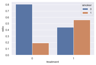
There are way more smokers among the patients in the treatment group (56%) compared with the control group (19%) - is that possible that smoking leads to a higher death rate?
Next, we do a simple 1:1 matching so that the smoker ratio in the control and treatment groups will be the same. For each patient in the treatment group, we randomly choose a patient from the control group to match:
- if the treated patient is a smoker, we select a smoker from the control group
- if the treated patient is not a smoker, we select a non-smoker from the control group
Here, we use random sampling without replacement, i.e., once a patient in the control group is matched with a patient in the treatment group, he cannot be used to match other patients.
After matching, the smoker patient ratio in control and treatment groups is the same:
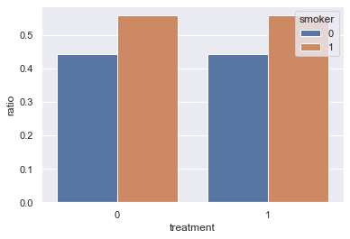
Note: given there are patents that are not matched, the total number of patients in the matched dataset is often smaller than the original dataset.
Now, if we compare the death rate in the matched control group (56%) and treatment group (34%), we would have the following conclusion:
Given the ATE (average treatment effect) is -0.22 (0.34 - 0.56), the percentage of death will decrease by 22% if the treatment is conducted.
So, the treatment should be done.
After matching, our conclusion about the treatment is the opposite!
In the simple matching example above, we match patients only based on one binary feature: smoker or not. In real datasets used in observational studies, each observation often has many features. Matching observations with the same values across multiple features is often not feasible.
Let’s look at a Groupon example:
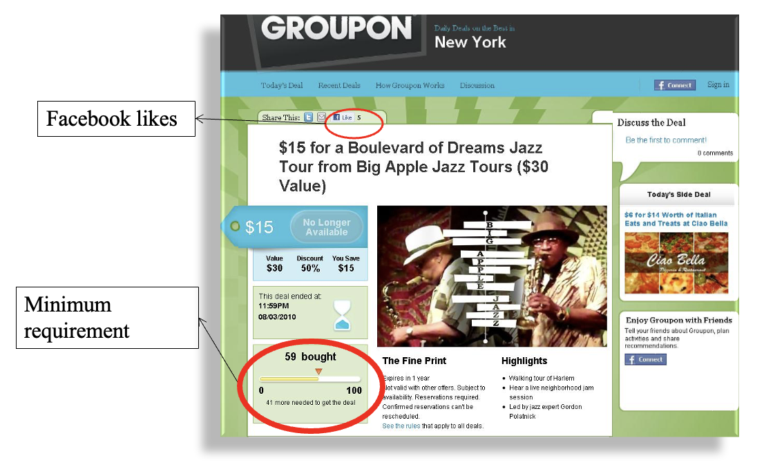
Some Groupon deals have a minimal requirement, e.g., as shown in the picture above, the deal only works when there are at least 100 committed buyers.
So, we can define:
- Control group: deals without the minimal requirement
- Treatment group: deals with minimal requirement
We are interested in:
Does having the minimal requirement affect the deal outcomes, such as revenue, quantity sold, and Facebook likes received?
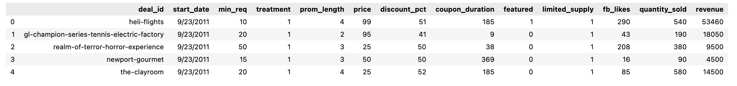
groupon.csv has the following structure:
Finding two deals from different groups with exact matches across different features, such as price, coupon_duration, featured or not, etc. would be very difficult if not impossible.
Therefore, we need to use propensity score matching.
The propensity score definition is simple:
propensity score is the probability for an observation (a deal in this case) to be in the treatment group
The calculation of the propensity score can then be translated into a binary classification problem: given the features of a deal, classify each deal as 0 (without minimal requirement - control group) or 1 (with minimal requirement - treatment group).
Two issues here:
- what model to use for classification: logistic regression is often used.
- what features to select: as we will illustrate later, the following features/variables should be excluded:
- features/variables that predict treatment status perfectly, such as
min_reqfeature, which thetreatmentfeature is directly derived from (see the code notebook for the result of addingmin_req). - features/variables that may be affected by the treatment
- features/variables that predict treatment status perfectly, such as
So, we use prom_length, price, discount_pct, coupon_duration, featured, limited_supply features to train a logistic regression model to predict target variable treatment:
X = df[['prom_length', 'price', 'discount_pct', 'coupon_duration', 'featured','limited_supply']]
y = df['treatment']
from sklearn.linear_model import LogisticRegression
lr = LogisticRegression()
lr.fit(X, y)
pred_prob = lr.predict_proba(X) # probabilities for classes
# the propensity score (ps) is the probability of being 1 (i.e., in the treatment group)
df['ps'] = pred_prob[:, 1]
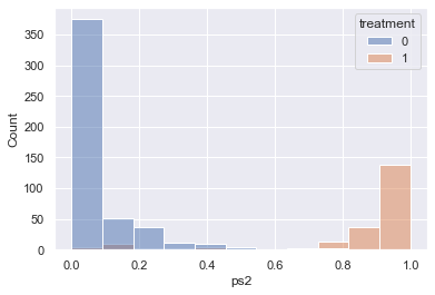
# check the overlap of ps for control and treatment using histogram
sns.histplot(data=df, x='ps', hue='treatment')
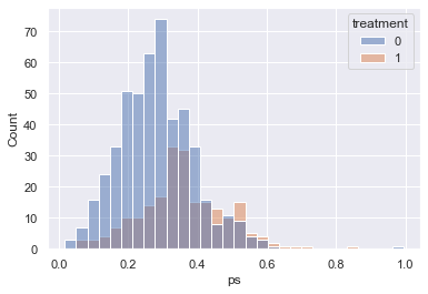
The figure above shows major overlaps of the propensity scores in the control and treatment group, which is a good foundation for the matching, i.e., if there are no or few overlaps, it’s impossible/difficult to find enough matches.
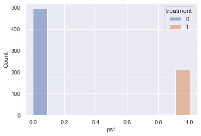
For example, if min_req is used to calculate the propensity score, there won’t be any overlaps as shown below:
If we plot revenue with start_date, we can see that the date is highly correlated with treatment:
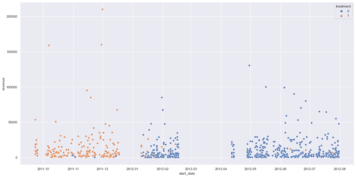
if start_date is used to calculate the propensity score, there is only little overlap resulting in not enough matched observations:
The matching based on propensity score is simple:
- for each observation in the treatment, use KNN to find the top N closest neighbors in the control group based on the propensity score (here, use a fixed radius/caliper, such as 0.05 or use 25% of the standard deviation of the propensity score as radius/caliper)
- if 1:1 matching, pick the closest one as the match
- if 1:M matching, pick the M closest ones from the top N as the match
- a match cannot be reused if replacement is true
- drop observations without any match
One way to see the matching effect is to show the mean difference of the features from control vs. treatment groups before and after the match - we hope to decrease the differences via matching, i.e., the characteristics of the deals are more similar in both control and treatment groups after matching.
The following table and figure show the before/after p-values of the mean difference and the effect size for different features used for calculating the propensity score:
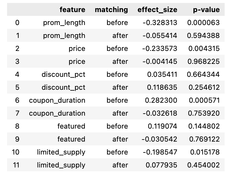
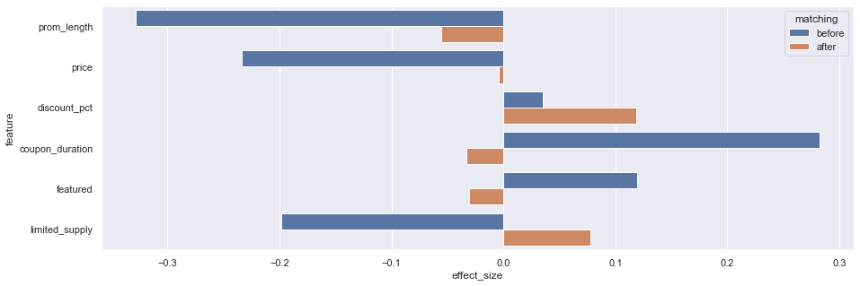
We can see except that discount_pct and featured are not significant, all other features are more similar/balanced after matching.
We can then conduct t-tests (see code notebook for details) for the dependent variables in the dataset before and after the match:
- for revenue (
revenue), p-value changed from 0.04 to 0.051. 0.051 is not significant meaning that having minimal requirements does not change revenue. - for Facebook likes received (
fb_likes), p-value changed from 0.004 to 0.002. Both are significant meaning that having the minimal requirement increases the facebook likes received.
In the Propensity Score Matching (Python) notebook, I also include the code to use psmpy package, which generates similar results. Given that the package is not open-sourced yet - I cannot check the details.
Difference-in-Differences
The difference-in-differences method is a quasi-experimental approach that compares the changes in outcomes over time between a population enrolled in a program (the treatment group) and a population that is not (the comparison group). It is a useful tool for data analysis. - World Bank
The full Python code can be accessed at Kaggle: Difference-in-Differences in Python
The dataset is adapted from the dataset in Card and Krueger (1994), which estimates the causal effect of an increase in the state minimum wage on the employment.
- On April 1, 1992, New Jersey raised the state minimum wage from \$4.25 to \$5.05 while the minimum wage in Pennsylvania stays the same at \$4.25.
- data about employment in fast-food restaurants in NJ (0) and PA (1) were collected in February 1992 and in November 1992.
- 384 restaurants in total after removing null values
The calculation of DID is simple:
- mean PA (control group) employee per restaurant before/after the treatment is 23.38/21.1, so the after/before difference for the control group is -2.28 (21.1 - 23.38)
- mean NJ (treatment group) employee per restaurant before/after the treatment is 20.43/20.90, so the after/before difference for the treatment group is 0.47 (20.9 - 20.43)
- the difference-in-differences (DID) is 2.75 (0.47 + 2.28), which is (the after/before difference of the treatment group) - (the after/before difference of the control group)
The same DID result can be obtained via regression, which allows adding control variables if needed:
$y = \beta_0 + \beta_1 * g + \beta_2 * t + \beta_3 * (t * g) + \varepsilon$
- g is 0 for the control group and 1 for the treatment group
- t is 0 for before and 1 for after
we can insert the values of g and t using the table below and see that the coefficient ($\beta_3$) of the interaction of g and t is the value for DID:
| Control Group (g=0) | Treatment Group (g=1) | ||
|---|---|---|---|
| Before (t=0) | $\beta_0$ | $\beta_0 + \beta_1$ | |
| After (t=1) | $\beta_0 + \beta_2$ | $\beta_0 + \beta_1 + \beta_2 + \beta_3$ | |
| Difference (After - Before) | $\beta_2$ | $\beta_2 + \beta_3$ | $\beta_3$ (DID) |
The following shows the result of the regression for the employment dataset:
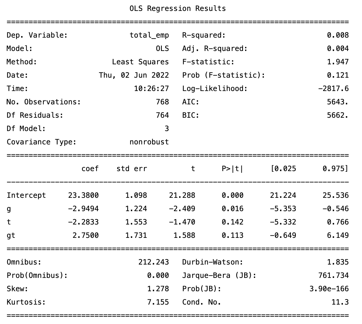
The p-value for $\beta_3$ in this example is not significant, which means that the average total employees per restaurant increased by 2.75 FTE (full-time equivalent) after the minimal salary raise but the result may be just due to random factors.
References
PS. The image for this post is generated via Midjourney using the prompt “Quasi-Experimental Methods”.